Website Revamp
The main purpose of this website is to showcase the products they offer.
Client
Mid Ontario Doors
Service
Development, UX Design
Date
April 6, 2022
Challenge
Adding new products and revising existing products to reflect the new catalogue. Updating the look and feel of the website so it is modern and professional.
Solution
Defining sections or bands on the homepage gives some structure and organization, helping customers with general idea who the client is and what they're all about.
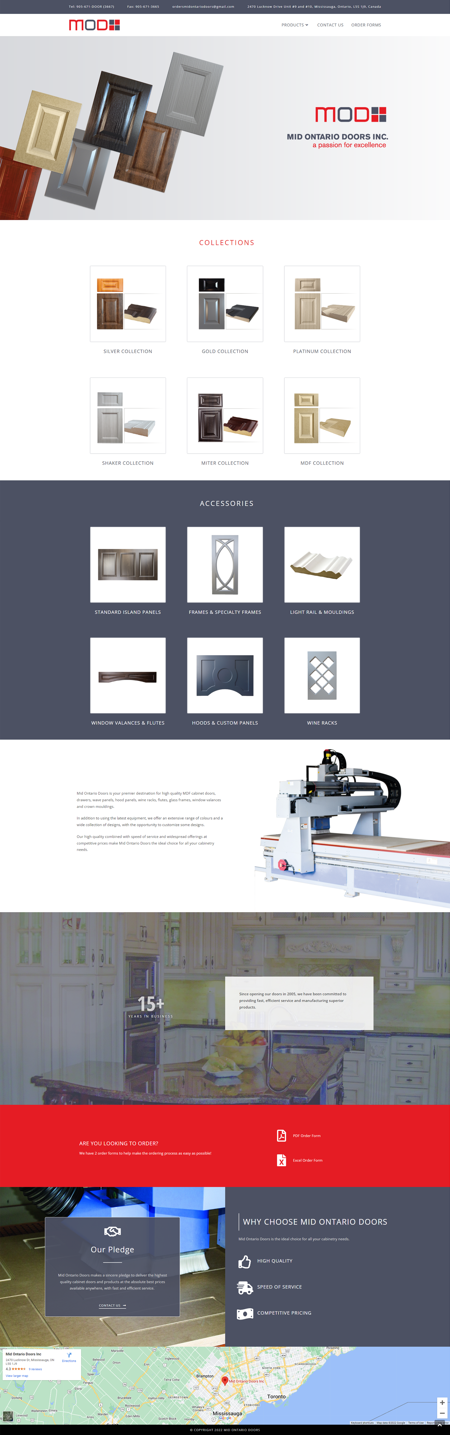
Before/After of Homepage
The header banner at the top of the old site looked clunky and amateurish. I made an upper nav ribbon with the contact information as actual clickable link text rather than an image of text. The way the homepage is now sectioned now makes it easy for a potential customer to browse/scroll and get an impression of the client that builds confidence..
Before/After of Product Page
The "Before" Product page had images taken from the catalogue but the text was also image. Whenever possible text should be text to be more web and user frienly. So the main change here is just that, the text is now text, and the product images and profile line images are clickable and open up modals with a larger view..
Before/After of Contact Page
Organizing the address and contact information with icons, and moving the hours info into a proper table an to the right in a two column layout so it is more dynamic and visually appealing. The contact form on the old site was broken so I fixed that..
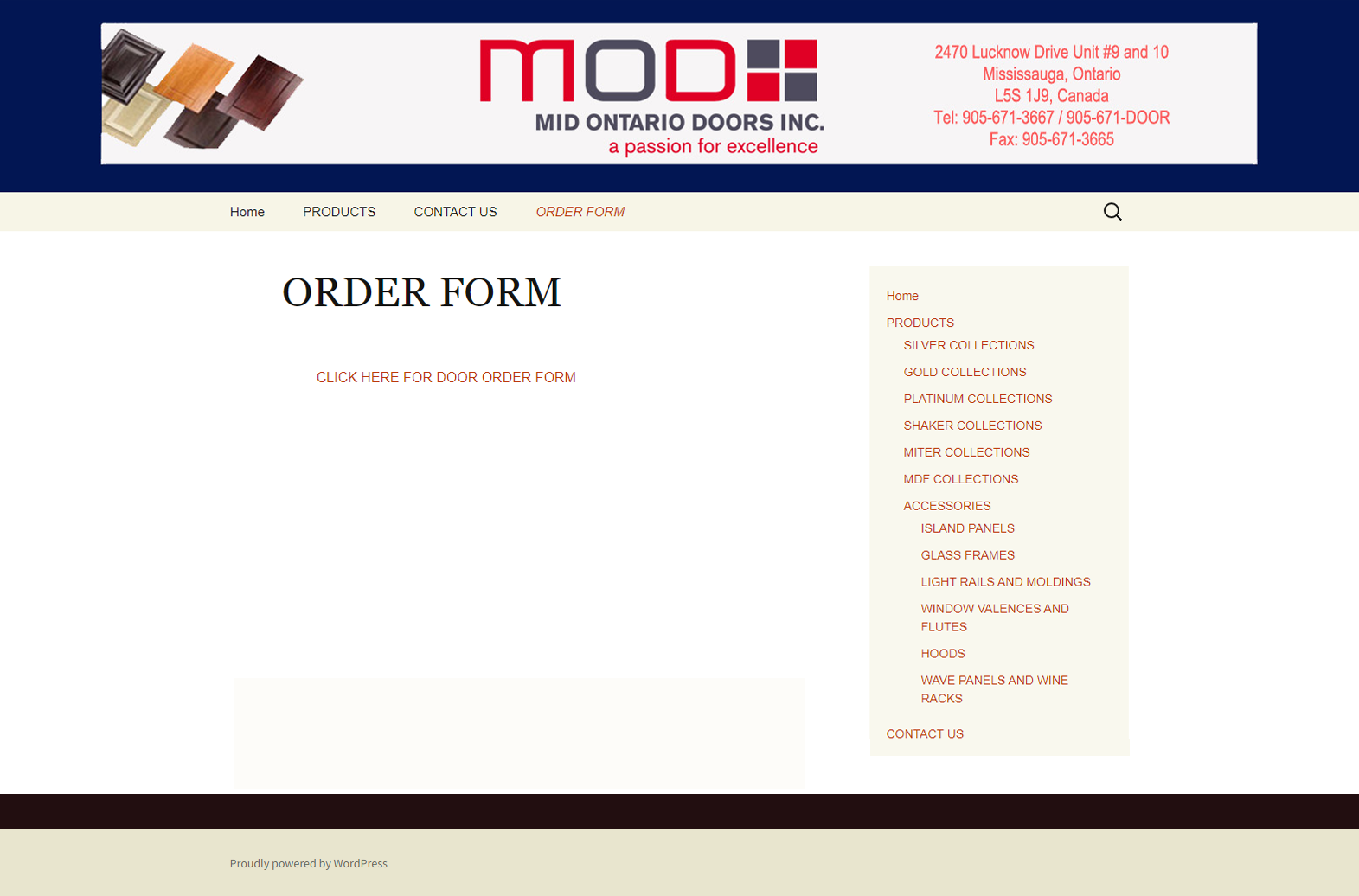
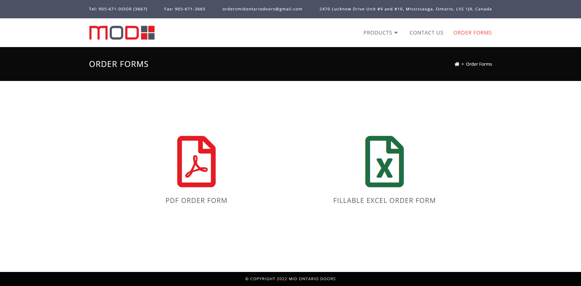
Before/After of Order Form Page
The client did not want an order form to be handled online through the website, they wanted to add another format, so using large icons for the type of file was the best solution to make this simple page visually appealing and user friendly..